Designite

Designite

Designite featuring great design, architecture, fashion, graphics and innovation from across the globe.


Wink Lashes

For the professional Wink Lashes series, a unique, attractive package was created, revealing the benefits of the brand. The graphic symbols help to display the main idea of the design - a magical transformation. The "Eye" image was a basis, whereas a separate visual element in the corresponding design was created for each product line. The correct use of color helped the brand embrace a complete look and effectively communicate with the customer. The developed design increased the level of brand awareness and popularity and made the TM more competitive.

Continue reading
 

Pepsi Culture

Pepsi Culture celebrates Mexico through a series of limited-edition cans. The design explores the rich and vibrant cultures of six Mexican cities and their passion for the arts and crafts. Through meaningful symbols and regional references the designs are brought to life as illustrative patterns that honor century old traditions and infuse contemporary design aesthetics. This blend ancient meanings and modern design sensibilities creates a rich narrative that perfectly reflects the ethos and modernity of the Pepsi brand.

Continue reading


Rosa Roxburghii

In order to better communicate with consumers, enhance the local characteristics and charm of rosa roxburghii and tea culture, it combine the aesthetic feeling of traditional culture and modern elements to interpret the life concept of returning to original nature, and staying healthy and progressive embedded in the brand. The overall design is based on the "Chinese style" illustration of rosa roxburghii tea garden, which outlines the rigor from planting to selection of materials that is embedded in the brand, and conveys the essence of the fusion of Chinese tea and rosa roxburghii.

Continue reading


Hotel New Grand Ready-to-eat Meals

This product is a ready-to-eat meals package design for the only classic hotel in Yokohama. They wanted to convey the tradition and prestige of the hotel with a little wit to entertain those who saw this design. With a design based on the motif of a stockpot, this product brings the flavors of the finest dishes prepared by top chefs working in hotel kitchens to the comfort of your home. Enjoy the authentic texture of slowly simmered curry and soup whose aroma has been fully preserved.

Continue reading


Primary Residence

Primary Residence is an alphabet design that represents abstract architectural forms in typography with three primary colors: red, blue, and yellow. The inspiration originally came from the Bauhaus movement. That was also inspired by the design of stairs and windows from different parts of the world. Each letter and number represents a small part of the buildings without any apparent entry or existence. The stairs, windows, and geometric shapes are dedicated to the Bauhaus architectural style and minimalism, with the primary goal of blending the form and identities of the structure together.

Continue reading


The Soloist

The Soloist Chinese Tea blends traditional Chinese culture and modern aesthetics. Through the ingenious combination of form and meaning, it creates a unique packaging style which impresses the audience deeply. Seven true flavors from the mountains and nature can bring you into a peaceful world in a moment. The unique visual impression and high-quality material experience fully meet the buyers' pursuit.

Continue reading


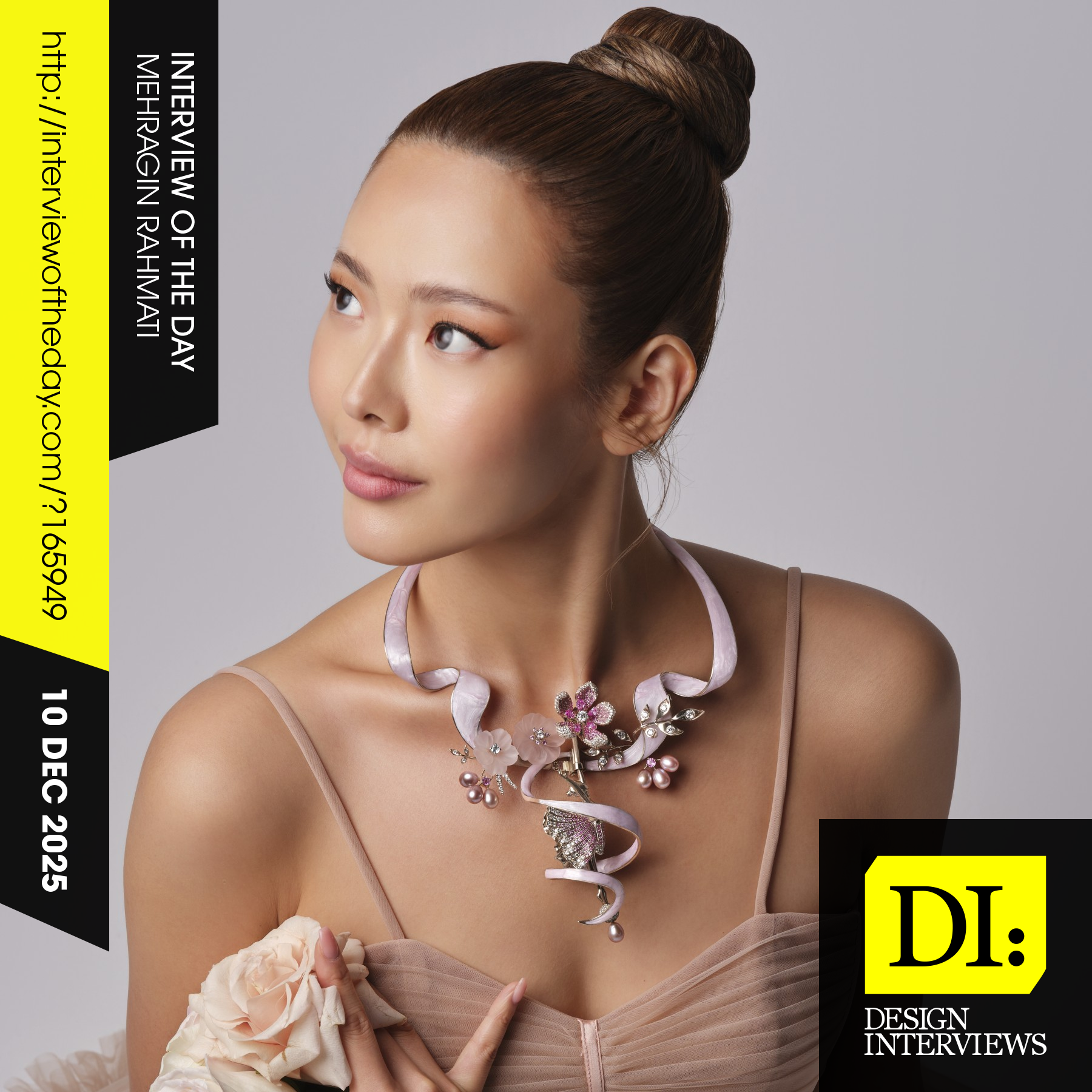
Design interview of the day

Read the latest interviews and conversations on design, creativity and innovation between design journalist and world-famous designers, artists and architects. See latest design projects and award-winning designs by famous designers, artists, architects and innovators. Discover new insights on creativity, innovation, arts, design and architecture. Learn about design processes of great designers.

Continue reading