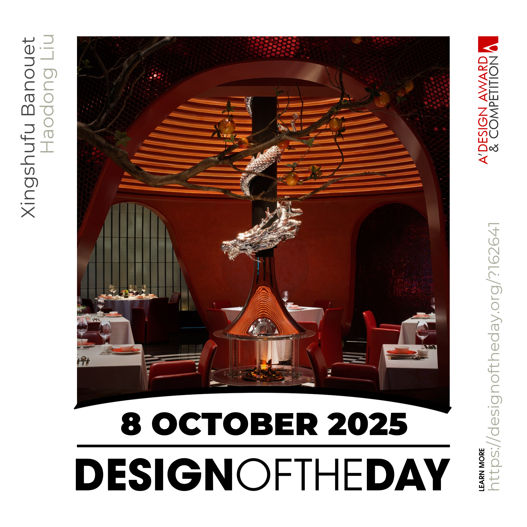
Designite

Designite

Designite featuring great design, architecture, fashion, graphics and innovation from across the globe.


Prakrishi

Designer was commissioned to create range of dry fruit packaging meant for Indian market with strong visual narrative. Designer has created a packaging range with strong visual story of dry fruits where each nut is depicted as a king of its kingdom known as kingdom of health. Distinguished looking packaging further enhanced by using right set of color palette. By keeping entire packaging in monochromatic and only dry fruits have been kept in color photograph which is working as a focal point of packaging, the range is coming across very strong on shelf.

Continue reading


Mminni

Mminni-X-Lab is a brandy designed for young people. X means unknown, infinite possibilities, goals and hopes in the design, which represents the exploration spirit of young people. The idea of design inspired by the product concept of towards the unknown and shine. In order to get rid of the traditional idea of brandy and produce a new brand recognition, the design uses unknown and color as the creative point to attract young people.

Continue reading


Kum-Kum

The bottle has symmetrical droplets on its four sides, two facing upward and two facing downward, which shape the form of water in its dynamic substantiation. As for the label and logo, Backbone Branding has created a combination of a label and a filled bottle, which shows the transparency and plasticity of the water in its dynamics. The blue tint of the back label blends harmoniously with the bottle and, thanks to the refraction of light through the liquid, makes the bottle visible, and the brand's white logo on the transparent label becomes apparent due to the blue-tinted back label.

Continue reading


The Devil's Keep

The inaugural release from The Craft Irish Whiskey Co., The Devil’s Keep Experience Box has been created with the most luxurious attention to every single detail, embodied by a dark stained oak finish and brass detailing. It all starts with the strong minimalist visuals on the outside, locked by an ancient Japanese lock with a dedicated key stored at the back. Only by unleashing the experience box from its ancient lock, you will be able to immerse into the contents inside, where dark burgundy leather walls hold the tasting accessories, crucial to experiencing the Devil’s in full.

Continue reading


Constellation

The packaging of the lighters represents Zippo’s core value, “We inspire.” The lighters are under a high-end product line for Zippo. To provide a comprehensive collection for Zippo enthusiastic, the packaging was exclusively developed as a limited edition with only a hundred units produced. The packaging engages the user by lighting up the zodiac signs. It enhances the esthetic aspect of the packaging and highlights the concept in a unique way. The structure of the packaging is designed specifically so it can stand upright and the lighters can be attached and displayed on the surface.

Continue reading


Mirzam: Monsters Collection

Chocolate-makers from the UAE (Dubai) needed a branding for handcrafted bean-to-bar chocolate. From the naming and identity to the product design and packaging, the team designed each element with a fascinating story around the whole concept. The brand based on journeys through the ancient Orient along long-forgotten ocean routes and pathways was created. A journey from one country to another, meeting monsters and mythical characters. The packaging design is the illusion of a journey between myth and reality.

Continue reading


Amazing design. Good design. Best design.

Good designs create value for society. Everyday we feature a special design project that demonstrates excellence in design. Today, we are pleased to showcase an award-winning design that makes a positive difference. We will be featuring more great and inspiring designs daily. Make sure to visit us everyday to enjoy new good design products and projects from greatest designers worldwide.

Continue reading